A’ Design Award 2019
INSPIRATION
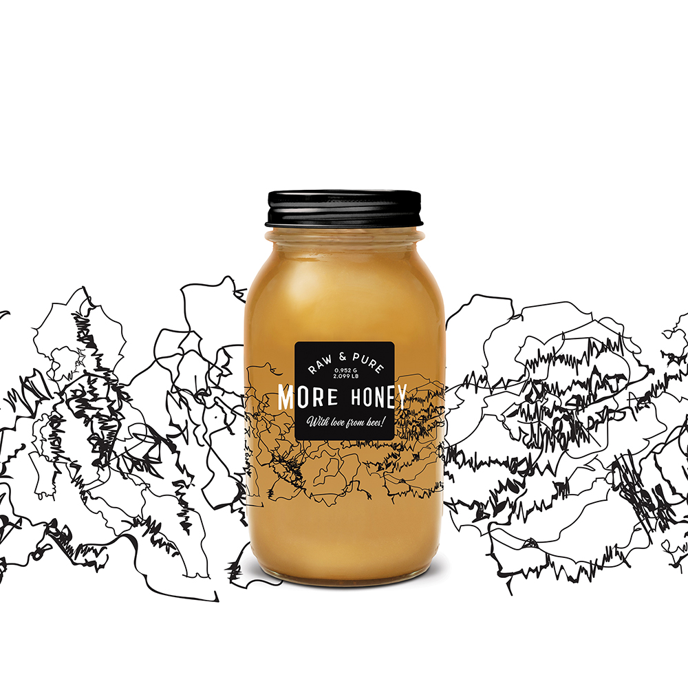
I am inspired by bees, their expression and behavior intrigues me. They try to find the most pollen and nectar in the least amount of time. To do this, they communicate flower location to other bees by using a special dance called the waggle. This dance tells the other bees the flowers distance and direction from the hive. I used their dance trajectories to create a continuous, abstract pattern. The idea is to show the perfect world of bees, their diligence, dedication and intelligence.
PROJECT DESCRIPTION
I created branding and packaging for all natural honey. Most of the honey available in supermarkets is not natural, with many additives and impurities. Pure honey is the natural product of honey bees, made only from their natural processes, uninterrupted or manipulated by humans. The goal was to appeal to a new generation of honey lovers, hipsters with old school style and a little extra money in their back pocket, interested in healthy nutrition.
The brand name More Honey is displayed over a black square with the letters spilling over the edges. It strengthens the meaning of the name.
REALIZATION TECHNOLOGY
I chose Mason jars because they represent a wholesome, simpler way of life. But there is more to these jars than just their timeless aesthetic and nostalgia. They speak to our awareness of the environmental, economic, and health costs of consuming processed foods. They are reusable, durable and do not easily chip. The uses are nearly endless. More Honey jars, with their pleasing shape and transparency, suggest a kind of wholesome luxury. Clear label with white and black screen print.
RESEARCH ABSTRACT
Inspired by the bee waggle dance and decided to use their trajectories to create a pattern. As a result, I managed to avoid the traditional honey visual cliches such as bees, drops or honeycomb and created a unique and memorable label design.